AeroNav
INDEPENDENT PROJECT
Product
End-to-end mobile app for iOS
Industry
Travel
My Role
UX/UI designer, user researcher, brand designer
Length
80 hours
Tools
Figma, FigJam, Google Suite, Notion, Optimal Workshop, Maze, ChatGPT

Navigating through airports can often feel like an intricate puzzle, with layovers, complex layouts, and a lack of real-time information transforming what should be an exciting journey into a stressful ordeal.
Enter AeroNav, your ultimate travel companion, designed not just to alleviate frustration but to transform your pre-flight moments into an opportunity to earn rewards while feeling confidently prepared to take off.
Problem
Modern air travel is a labyrinth of frustration, marked by endless wait times, unforeseen delays, and a lack of reliable support.
Solution
A comprehensive mobile app designed to redefine the day-of-flight experience.
Design Process
1. Discover
-
Competitive Analysis
-
Survey & Interviews
-
Affinity Diagram
2. Define
-
POVs/HMWs
-
User Persona
-
Feature Set
-
Card Sort
-
Sitemap
-
Task Flows
-
Low-fi Sketches
3. Develop
-
Mid-fi Wireframes
-
Mid-fi Usability Tests
-
Branding & Visual Design
-
Hi-fi Wireframes
4. Deliver
-
Prototype
-
Usability Tests
-
Iterations
1. Discover
Unveiling Travelers' Desires and Dilemmas
My journey kicked off with a mission: understand the issues travelers face from the point of leaving their home to reaching their flight gate.
The question was simple: What are the pivotal pain points within the day-of-flight travel period? This research stage was not just about identifying problems but also about uncovering the canvas on which AeroNav would etch its user-centric design.
Competitive Analysis
Navigating the competition, I studied different travel apps, focusing on those connected to airports. I found strengths and weaknesses, spotting opportunities for AeroNav.
One gap stood out: the lack of apps showing accurate and detailed airport maps as well as real-time security wait times. And the few that did only covered one airport, typically an enormous airport hub.
This realization sparked an idea . . .
. . . could AeroNav be the all-encompassing solution, providing real-time security wait times, airport maps, and comprehensive airport information for any airport, anywhere?

User Research
Diving deeper, I began my discovery research, employing ChatGPT to streamline planning. This strategic move aimed not just for efficiency but for maximizing the value of every research effort.
Research Goal
Find out the challenges travelers face on the day of their flights.
Key Research Questions
-
What are the main pain points that travelers experience during the day-of-flight travel period, from leaving their homes to reaching their gate inside the airport?
-
How do these pain points affect travelers' emotions and behaviors during the day-of-flight travel period?
-
What information do travelers need to feel informed and prepared during the day-of-flight travel period?
I started with quantitative surveys, casting a wide net for traveler insights. Thirteen responses gave me a glimpse into their world.
100%
dealt with flight delays or cancellations
92%
wanted real-time security wait times
62%
needed directions to gates and key areas
62%
sought dining and shopping information
With these statistics in mind, I conducted 1:1 moderated user interviews to learn firsthand about travelers' experiences, preferences, and pain points. Five participants shared insights, creating a clearer picture. I created an affinity diagram in FigJam to better visualize commonalities between participants.

Most Prominent Patterns
-
Timing issues: Some arrived early to the airport, others later.
-
Security hassles: Different rules at each airport.
-
Navigating airports: Problems in large airport hubs or during layovers.
-
Convenience seekers: Desire for easy access to airport amenities.
With my discovery research in hand, it was time to set a clear direction.
2. Define
Crafting the Blueprint for AeroNav
Point-of View Statement
I wanted to explore ways to help travelers navigate airports with ease and efficiency because of the challenges travelers face in unfamiliar environments, the desire to make the most of their airport experience, and the need to stay on schedule during their travels.
How might we . . .
-
enhance the airport navigation journey for travelers?
-
create an airport navigation experience that's accessible, inclusive, and sustainable for all?
Putting a Face to Our User
I visualized my target audience through a persona that best represented them. This persona crystallized the user I was designing for, giving me a concrete image of their needs and motivations. Meet Sarah, a frequent traveler who wants to make the most of her airport experience.

Mapping the App Journey
Armed with research insights and the persona, I began constructing a roadmap for app features.
Absolute must-have features included interactive airport maps, real-time security wait times, and accessibility options.
Down the road (or runway), features such as personalized shopping and dining recommendations and an AI chatbot assistant would contribute to an even more personalized and delightful user experience.
Next, I conducted an unmoderated open card sort with Optimal Workshop. This offered a glimpse into users' content categorization preferences. With this knowledge, I crafted a sitemap, a blueprint for the app's structure.
Navigating the Task Flow
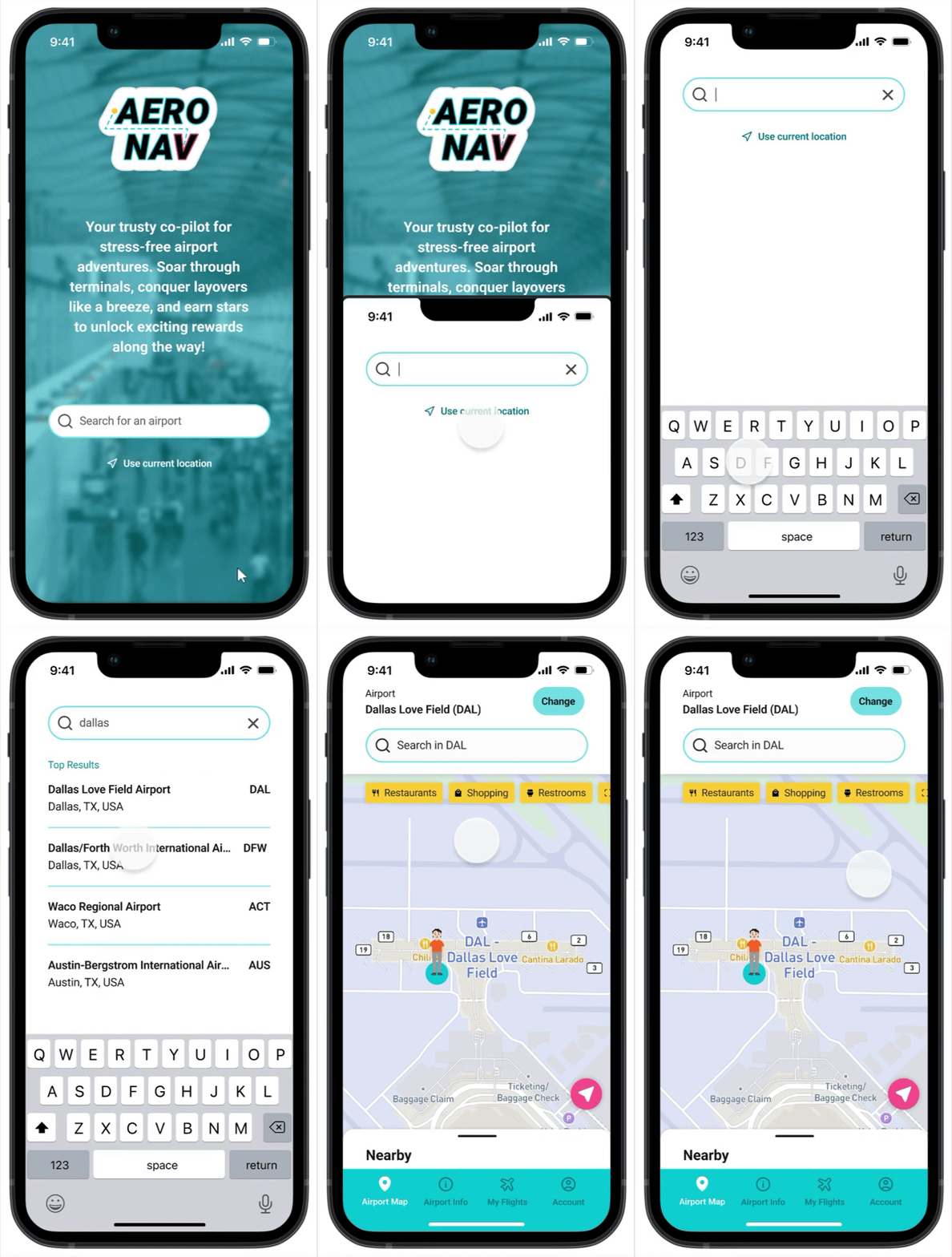
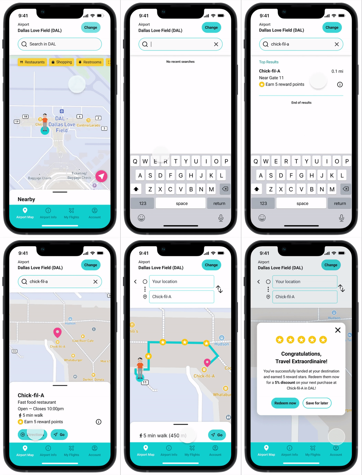
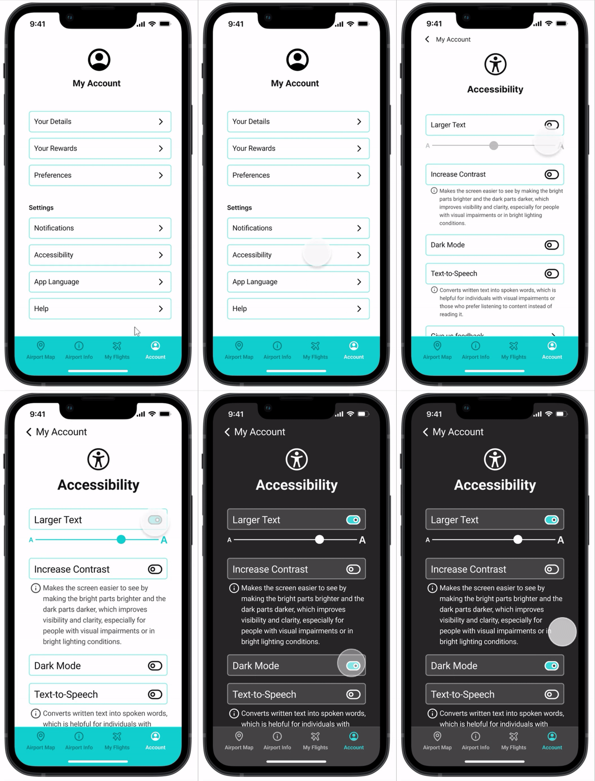
Considering my research scope and available resources, I focused on 3 vital flows: selecting an airport to view the map, finding and navigating to a destination, and enabling accessibility features such as Larger Text and Dark Mode.
Airport Selection
Basic Navigation
Accessibility Settings (Larger Text and Dark Mode)
Sketching Possibilities: Low-fidelity Designs
The design canvas called, and I responded with low-fidelity sketches, outlining the app's potential appearance. These sketches followed familiar design patterns, boosting usability. I drew inspiration from various navigation apps to shape the layout.

The Define stage laid the groundwork for AeroNav's transformation from concept to reality. With a crystal-clear focus and a roadmap in place, the journey to crafting a seamless and rewarding airport navigation experience was set in motion.
3. Develop
From Blueprint to Reality
Mid-fidelity Wireframes
Transitioning from paper to pixels, I translated my sketches into mid-fidelity wireframes. The aim was clarity; keeping things simple to avoid premature complexity.

At this point, I wanted to ensure the app's navigation aligned with users' expectations, so I conducted a quick, unmoderated mid-fi usability test survey. It was a brief but essential step to gauge users' intuition about finding key information.
100%
of responses expected the same information to be found in the same places
The next horizon was visual design.
Visual Identity: Logo and Branding
Reflecting the app's essence as a navigation tool, I crafted a bold and dynamic logo, evoking the journey from start to destination.


Steering clear of the mundane, I opted for a distinct palette. White as the background, with accents of aqua blue, magenta pink, and bright yellow. This mix cultivated a vibrant, modern experience, while ensuring readability and contrast. I strategically employed these hues to breathe life into the airport navigation interface. Aiming for clarity, I chose a simple, readable font.

High-fidelity Wireframes
Guided by mentor feedback, I recognized the app needed a spark. Why would users choose AeroNav over other options? This question steered me towards the concept of differentiation and user engagement. The solution: integrate a reward system and subtle gamification, moving these features from "Nice to Have" to "Must Haves." Users could now earn rewards for using the app, spurring more interaction. Avatars replaced standard icons, adding personality and connection.

This Develop stage was about turning plans into pixels. From wireframes to visual design, each step was a bridge bringing AeroNav closer to being more than just an app – a companion that rewards, guides, and uplifts the traveler's journey.
4. Deliver
Bridging Blueprint to Interaction
Protoype and Test
Time to connect the dots! I used Figma to create interactions between screens for the 3 key flows: airport selection, basic navigation, and accessibility settings.
Airport Selection

Basic Navigation

Larger Text & Dark Mode

With the core elements connected, I ventured into testing the prototype's waters. The trials took place through unmoderated tests on Maze. Up to this point, I only had experience with moderated testing, so I wanted to learn the ins and outs of Maze and try unmoderated testing.
Once I launched the usability test, I received 12 total responses.
What Went Well
-
100% success rate on 2 tasks: airport selection and accessibility settings
-
1 participant expressed the desire to use the "Current Location" button as an entry point, suggesting a potential usability enhancement.
-
2 users, however, mistakenly attempted to click the Larger Text slider before enabling the setting, leading to some confusion.
-
Positive feedback on colors and branding
What Didn't Go Well
-
Only 50% of participants completed the basic navigation task, with a mere third succeeding.
-
Several individuals veered off-course, using the Restaurants filter as an entry point.
-
My oversight: I failed to build out the flow with Restaurants as an entry point, leading to unexpected behavior. However, those who followed the expected path faced no issues.
What I Learned
This experience highlighted the importance of accounting for all potential entry points and building them into the prototype. User behavior might not always align with the anticipated path.
What I Changed Next: Iterations
-
Designed and prototyped an alternative flow for Task 2, incorporating the "Restaurants" filter as an entry point.
-
Adjusted the Larger Text slider behavior, removing it when the setting is off and displaying it for adjustment when the setting is on.
-
Created an additional flow for Task 1 using "Current Location" as an entry point.
-
Made the "Account" tab clickable directly from the airport map.
With these refinements, the updated prototype emerged, breathing life into AeroNav's features and functions.

Wrap-Up
Lessons Learned
In the course of this project, I gained many valuable insights:
-
The perils of assumption – understanding user problems without preconceived notions.
-
A newfound passion for branding that ignited my creative fire.
-
The realization that a user interface's power isn't solely in its straightforwardness; innovation can elevate user experience.
-
The importance of considering all potential entry points when crafting prototypes, ensuring that the design caters to various user behaviors.
Impact
In a live app scenario, success would be quantified by:
-
The number of app downloads, a testament to its value in travelers' lives.
-
The efficiency of finding and selecting destinations, translating into user satisfaction.
-
The rewards redeemed, reflecting engagement and loyalty.
-
The adoption of accessibility settings, a sign of inclusive design.
-
The echo of user feedback, shaping the evolution of the app.
Next Steps
-
Embark on further usability tests to refine the app's usability and address any remaining hitches.
-
Expand the horizon by designing and integrating additional features, ensuring the app remains a dynamic companion for all travelers.
-
Hand off the design to the developers, the moment when ideas materialize into functional reality.
This project's end is just the beginning. With lessons learned, a potential for real impact, and plans for the future, AeroNav has the potential to transform how travelers navigate airports, making their journeys smoother and more enjoyable.


